Code
import numpy as np

# Generate dummy data
x = np.arange(0, 10, 1)
a = np.random.randint(10, 100, size=len(x))
b = np.random.randint(10, 100, size=len(x))
c = np.random.randint(10, 100, size=len(x))This post will show you steps to transform your regular matplotlib with a more professional look and feel.
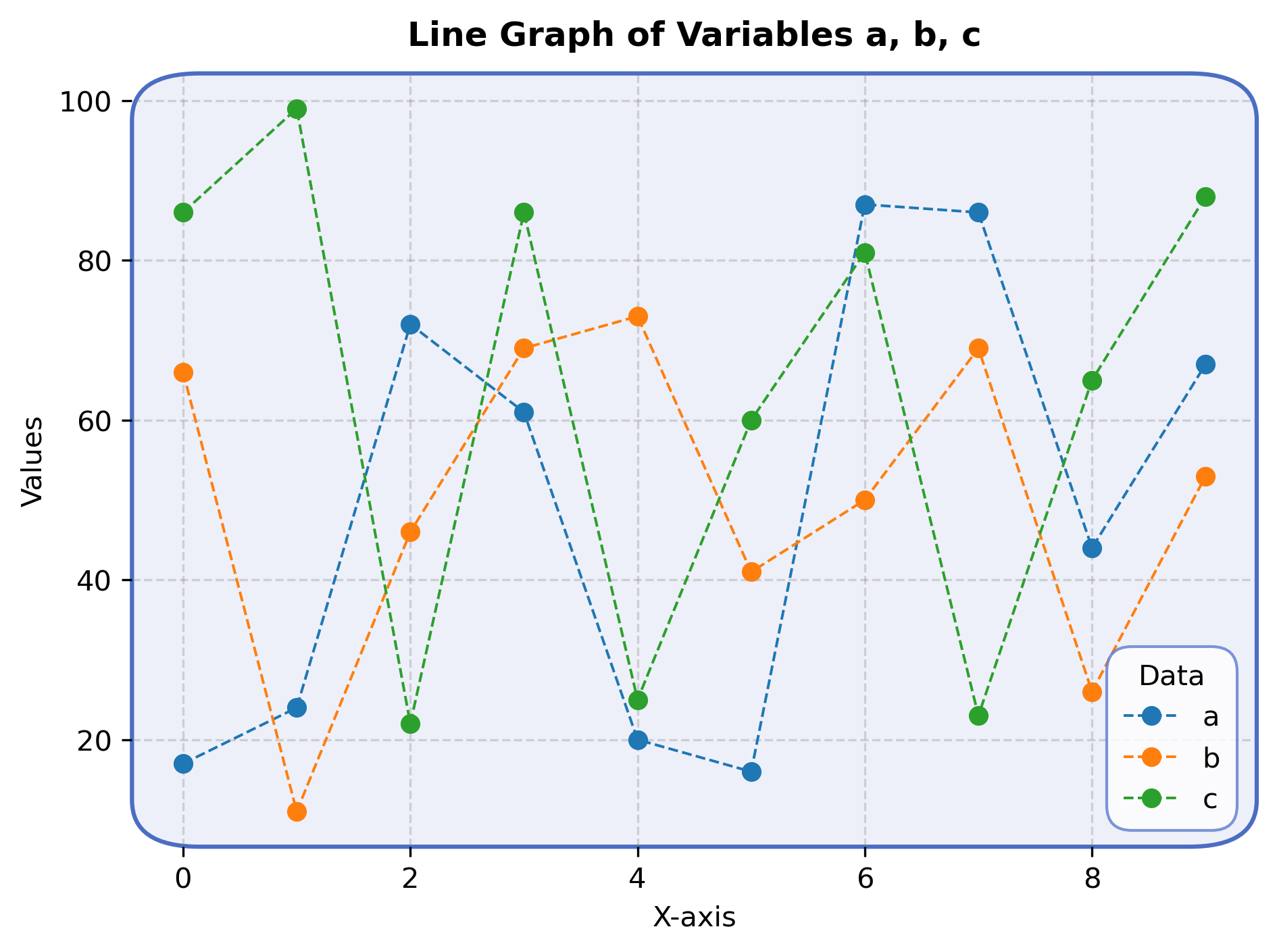
I have been using Matplotlib quite often and mostly used its regular look & feel. However, recenlty while working a project, I realised the need to make my visualizations more attractive and with an apealing look. For starters, I tried generating figures with rounded corners which I personally like very much.
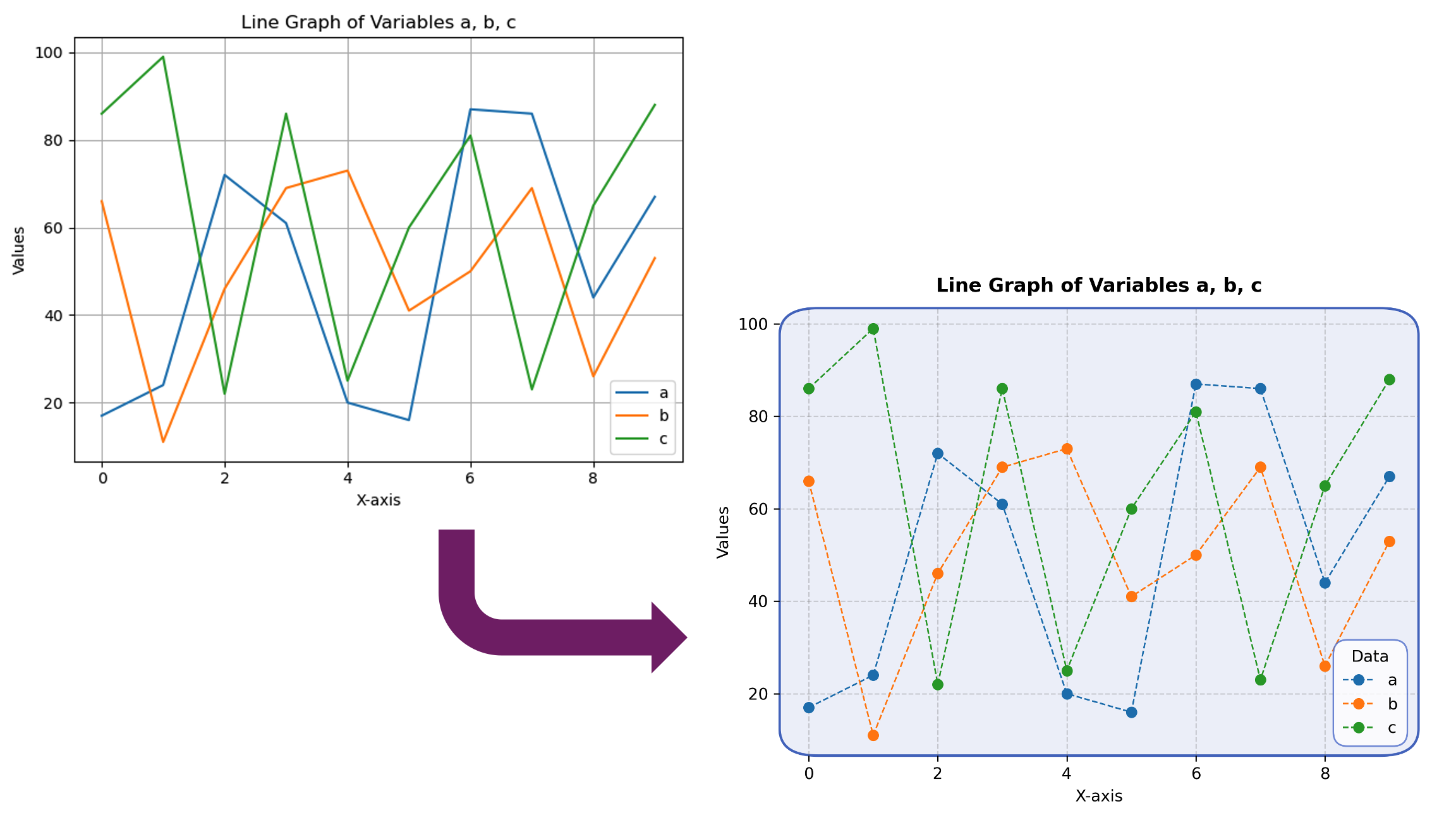
The below figure shows two visualizations, one using default style of matplotlib and second, using an updated style with rounded corners.
import numpy as np
# Generate dummy data
x = np.arange(0, 10, 1)
a = np.random.randint(10, 100, size=len(x))
b = np.random.randint(10, 100, size=len(x))
c = np.random.randint(10, 100, size=len(x))import matplotlib.pyplot as plt
# Plotting the data
plt.plot(x, a, label='a')
plt.plot(x, b, label='b')
plt.plot(x, c, label='c')
# Adding labels and legend
plt.xlabel('X-axis')
plt.ylabel('Values')
plt.title('Line Graph of Variables a, b, c')
plt.legend()
# Show plot
plt.grid(True)
plt.tight_layout()
plt.savefig('old.png',format='png')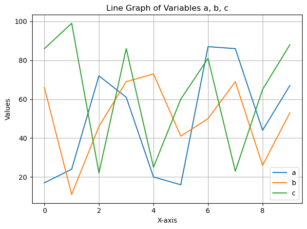
import matplotlib.patches as mpatches
import matplotlib.axes as axes
from matplotlib.projections import register_projection

import matplotlib.pyplot as plt

class StaticColorAxisBBox(mpatches.FancyBboxPatch):
    def set_edgecolor(self, color):
        if hasattr(self, "_original_edgecolor"):
            return
        self._original_edgecolor = color
        self._set_edgecolor(color)

    def set_linewidth(self, w):
        super().set_linewidth(1.5)


class FancyAxes(axes.Axes):
    name = "fancy_box_axes"
    _edgecolor: str

    def __init__(self, *args, **kwargs):
        self._edgecolor = kwargs.pop("edgecolor", None)
        super().__init__(*args, **kwargs)

    def _gen_axes_patch(self):
        return StaticColorAxisBBox(
            (0, 0),
            1.0,
            1.0,
            boxstyle="round, rounding_size=0.06, pad=0",
            edgecolor='#4B6DC2',
            linewidth=5,
        )

register_projection(FancyAxes)fig, ax = plt.subplots(dpi=300,subplot_kw={'projection': 'fancy_box_axes'})
ax.spines[["bottom", "left", "right", "top"]].set_visible(False)
ax.set_facecolor('#EEF0F9')
ax.grid(
True, # enable grid
color='gray', # light gray grid lines
alpha=0.3, # transparency
linestyle='--', # dashed style looks nicer in papers
linewidth=0.8 # slightly thin
)
ax.plot(x,a,'o',linestyle='--',linewidth=.95,label='a')
ax.plot(x,b,'o',linestyle='--',linewidth=.95,label='b')
ax.plot(x,c,'o',linestyle='--',linewidth=.95,label='c')
# Draw figure so that legend is placed
fig.canvas.draw()
# Add rounded corners to legend
legend = ax.legend(
title='Data',
frameon=True,
fancybox=True, # Enables rounded corners
edgecolor="#5C7BD1",
bbox_to_anchor=(.99, 0.01),
loc="lower right"
)
legend.get_frame().set_boxstyle("round,pad=0.2, rounding_size=0.9") # Adjust rounding
ax.set_xlabel('X-axis', fontsize=10)
ax.set_ylabel('Values', fontsize=10)
ax.set_title('Line Graph of Variables a, b, c', fontsize=12, fontweight='bold', pad=10)
plt.tight_layout()
plt.savefig('better.png',format='png')